One moment.
Loading page…
Design System
The parts this site is built from: the logo, the colors, the type, and buttons that look like an old radio. Every example is the real part, not a picture of it.
SECTION 01
SEVEN RULES
Seven rules the pages follow. You can check each one against this page.
Every page is a sheet of paper, 1240px wide at most, on a dark teal margin. Headlines are big, and a section opens with a thick rule.
Sunlit is cream paper with dark teal ink. After dark swaps them. One knob at the top of every page flips it, so every color comes as a pair.
Bodoni Moda, at its heaviest weight, sets the headlines. DM Sans sets everything else. There is no third.
Rust orange on Sunlit paper, peach After dark. It marks the last word of a headline, a small label or a ribbon, and not much else.
Paper has square corners, so cards do too. Most shadows are a solid block of ink, a few pixels down and to the right.
Polaroids, ribbons and the Let's meet link sit a few degrees off level, like things taped to a page. They move when you point at them.
Buttons that do something look like parts of the radio on the home page: brushed-silver keys that press down, and a chicken-head knob that turns.
SECTION 02
5 VERSIONS
Three waves since 2026. Before that, a mountain. Every version is here to download.
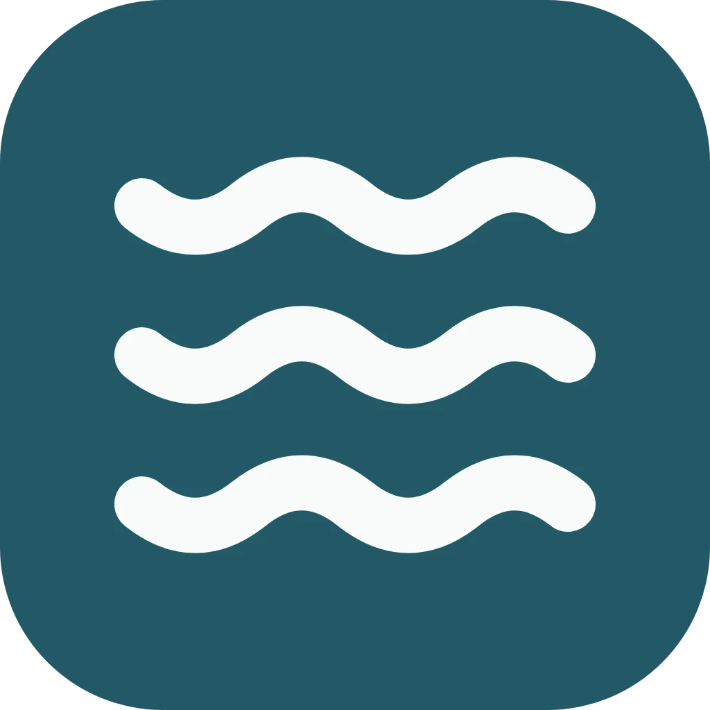
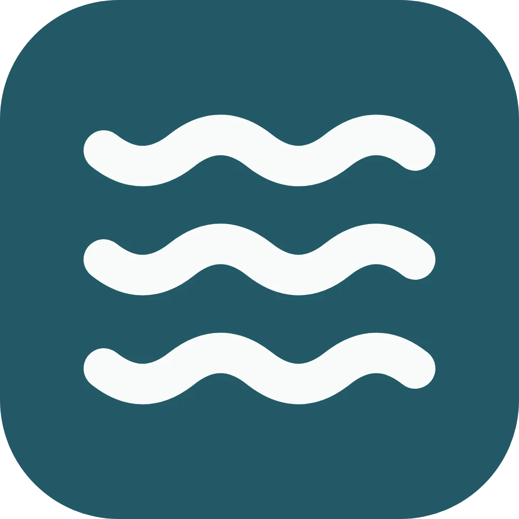
The 2026 logo. When we moved back to Florida, the mountain gave way to three waves in the site's teal. It's simple enough to read as a browser tab at 16 pixels, and it matches the drawn shorelines across the site.
Download image
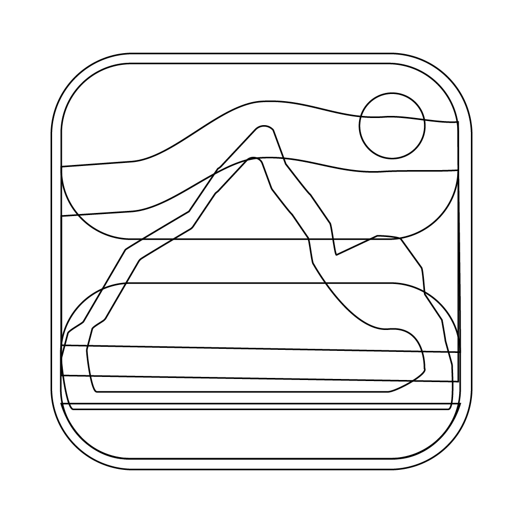
The original line-art sketch with layered mountain ranges, flowing horizon lines, and careful attention to depth. This version shows the complete vision with all the detailed landscape elements.
Download image
A bold, simplified outline focusing on the dominant peak. Clean and minimalist, this version captures the essential mountain shape without the sun, perfect for dark mode and high-contrast applications.
Download image
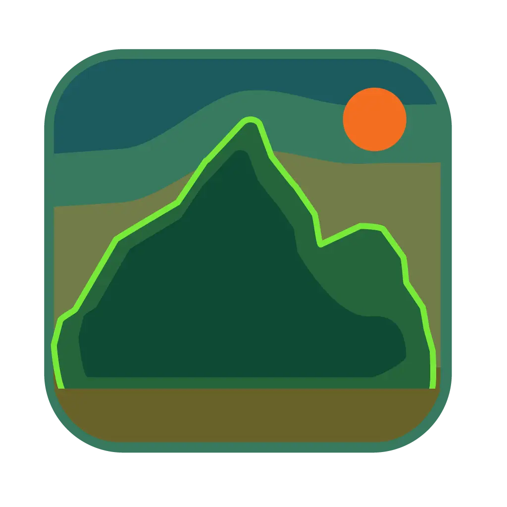
The full-color hero version with rich teal and olive tones creating depth, topped with the signature bright green outline and warm orange sun. This is the complete identity piece with all layers and colors working together.
Download image
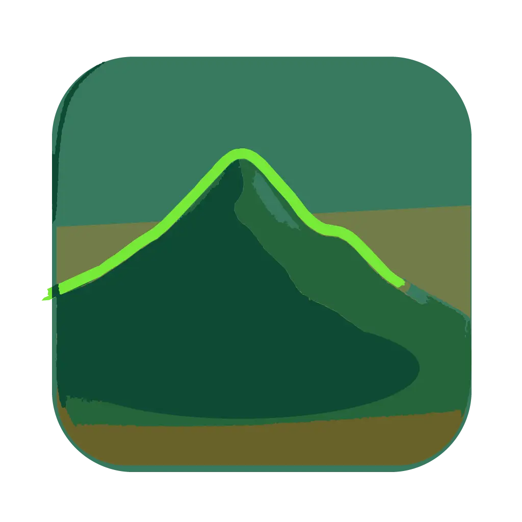
A single-peak interpretation optimized for small sizes. The bright green outline against darker tones ensures visibility at tiny dimensions, making it ideal for browser tabs and app icons.
Download imageSECTION 03
31 NAMED COLORS
Four colors paint an inner page, and each has a Sunlit value and an After dark value. The swatches are painted by the variables themselves, so turn the knob and they flip.
Set on .interior in interior.css. Other names on the site point back at these four.
--paperThe sheet every inner page is printed on
#eee5d2#142224--sheetA card or a polaroid lying on the paper
#f8efdd#263b3b--inkText, rules and hard shadows
#173437#eee5d2--accentThe last word of a headline, labels, the ribbon
#a33620#ffab80| Pair | Sunlit | After dark | Used for |
|---|---|---|---|
| ink on paper | 10.6:1 AA | 13.1:1 AA | Body copy |
| ink on sheet | 11.6:1 AA | 9.5:1 AA | Copy on a card |
| accent on paper | 5.4:1 AA | 8.9:1 AA | A headline's last word, small labels |
| accent on sheet | 5.9:1 AA | 6.4:1 AA | Labels on a card |
| paper on ink | 10.6:1 AA | 13.1:1 AA | A chosen tab, the end note |
| paper on accent | 5.4:1 AA | 8.9:1 AA | The ribbon |
The fixed values behind both editions. New styles read these instead of a raw hex, and pnpm check:css counts the old ones that still don't.
--bm-creamPaper, Sunlit
#eee5d2
--bm-cream-2Paper, a little warmer
#f1e7d4
--bm-sheetA card on the paper
#faf3e5
--bm-sandThe sand game
#e9dfc9
--bm-inkInk, Sunlit
#152e31
--bm-ink-2Ink, and the footer's paper
#173437
--bm-ink-3Ink in the sand game
#173e42
--bm-deepThe margin behind the column
#172f32
--bm-nightPaper, After dark
#142224
--bm-night-2A card on the night paper
#243638
--bm-accentRust orange, Sunlit
#a6321c
--bm-accent-darkPeach, After dark
#ffab80
--bm-accent-deepThe footer's top rule
#a33620
The silver, the lamp and the dial of the cassette radio on the home page.
--bm-silver-hiBrushed silver, the light edge
#e0e1d8
--bm-silverThe silver body
#cfd2cb
--bm-silver-loSilver, the shaded edge
#b5b9b5
--bm-silver-rimA key's outline
#778174
--bm-silver-edgeA key's thick bottom edge
#626d62
--bm-silver-warmA key under the pointer
#e2d7af
--bm-silver-pressA key pressed down
#a9b99b
--bm-lampA lit lamp
#ff5a30
--bm-dial-tickThe tuner's line and ticks
#c8bf98
The bucket and shovel that show while the sand game loads.
--bm-toy-tealThe bucket
#4fa3a5
--bm-toy-teal-deepIts rim
#3d8e91
--bm-toy-coralThe shovel
#e0573f
--bm-toy-sandThe sand heaped in it
#ead39f
--bm-toy-handleThe handle
#f4f6f2
Some inner pages still hold content from the beach site that came before this one, and that content paints with --coast-* variables. shell.css points each of them at the magazine’s colors, so old content wears the new palette without a rewrite.
| Old name | Reads | In plain words |
|---|---|---|
--coast-base | var(--paper) | The paper |
--coast-panel | var(--sheet) | The card color |
--coast-soft | color-mix(in srgb, var(--ink) 7%, var(--paper)) | Paper with a little ink in it |
--coast-ink | var(--ink) | The ink |
--coast-muted | color-mix(in srgb, var(--ink) 74%, var(--paper)) | Ink, thinned for small print |
--coast-accent | var(--accent) | The accent |
--coast-on-accent | var(--paper) | Text on an accent fill |
--coast-line | color-mix(in srgb, var(--ink) 30%, transparent) | A faint divider |
--coast-control-line | color-mix(in srgb, var(--ink) 45%, transparent) | The edge of a form field |
SECTION 04
2 TYPEFACES
Bodoni Moda sets the headlines, in one weight: 900, upright and italic. DM Sans sets everything else, in 400, 500 and 700. Both are served from this site.
| Class | Face | Size | Used for |
|---|---|---|---|
.interior h1 | Bodoni Moda 900 | 56 to 76px, line 0.94 | The page title |
.article-hero h1 | Bodoni Moda 900 | 40 to 58px, line 1.02 | A blog post's title, which is a sentence and not two words |
.interior h2 | Bodoni Moda 900 | 36px, line 1.05 | Section headings |
.end-note p | Bodoni Moda 900 italic | 28px, line 1.1 | The closing line of a page |
.page-polaroid figcaption | Bodoni Moda 900 italic | 22px, line 1.1 | The caption under a polaroid |
.archive-prose | DM Sans 400 | 15px, line 1.85 | Long reading: blog posts and project write-ups |
.interior | DM Sans 400 | 14px, line 1.7 | Body copy |
.action-link | DM Sans 700 | 12px | Links that look like buttons |
.page-kicker | DM Sans 700 | 10px, capitals, 0.14em apart | The small line above a page title |
Sizes are set on the class, not in tokens. Only the titles are fluid. The title at the top of this page is the h1, and every section heading here is the h2.
SECTION 05
NO TOKENS YET
There are no spacing tokens yet. These are the gaps the sheet uses most, read out of interior.css.
| Measure | Value | Used for |
|---|---|---|
| Column | 1240px | The widest the sheet gets. Past that, the teal margin shows |
| Margin | --bm-deep | The dark teal behind the column |
| Breakpoint | 640px | Below it, every grid on an inner page is one column |
| Intro measure | 36ch | The line length of the intro beside a page title |
| Reading measure | 60ch | The line length of a blog teaser |
A line’s weight says how big a break it is.
Corners are square. The only curves are on the hardware: a radio key has a 3px corner and a knob is a circle.
3px 3px 0 var(--ink) A boxed link4px 4px 0 var(--ink) A service card under the pointer5px 7px 0 var(--ink) The photo beside a page title7deg The ribbon4deg The polaroid beside a page title-3deg The Let's meet link-2deg A photo in a story row. The next one leans 2 degrees the other way-1deg The letter on the contact pageSECTION 06
11 PARTS
The classes the pages are built from. These are the real ones, not pictures, so point at them and press them.
A brushed-silver key that presses down like the ones on the radio. Press one.
Where: The link page, the resume downloads, the Play button further down this page.
shell.css
.edition-switch
A chicken-head knob that turns between Sunlit and After dark. This one is wired up, so it flips the whole site.
Where: The top row of every page.
shell.css
A boxed link with a hard shadow. It fills with ink when you point at it.
Where: Project cards, the contact letter, the end of this page.
interior.css
A boxed link that sits 3 degrees off level and straightens when you point at it.
Where: The bottom of the menu. The footer of this page has two more, as .footer-contact.
shell.css
A tilted orange ribbon set in Bodoni italic. The inline kind tilts less, so a longer line stays readable.
Where: The home page photo, and the teaser under a blog post's title.
shell.css
A thick rule with a small label at each end.
Where: The top of every section on this page, and on About, Projects and Blog.
interior.css
Outlined buttons in a row. The chosen one fills with ink.
Where: Projects, and the years on Conferences.
interior.css
Dates, a logo on a cream plate, the name and a short blurb. It lifts when you point at it. This one is a real link.
Where: Conferences.
interior.css
An ink band that closes a page with one line and a way out.
Where: About, Projects, and the bottom of this page.
interior.css
The home page is its own sheet, with its own stylesheet. Its paper is a shade warmer than an inner page’s.
The day, set big in Bodoni, beside the event's name and place. A meetup that repeats gets its series name as a small orange label.
Where: See you out there, on the home page, and the Events calendar.
shell.css
Small outlined labels in capitals.
Where: An event's page.
shell.css
SECTION 07
SHORT AND ON REQUEST
Most motion answers you: press a key, turn the knob, open the menu. The moves are short. Press Play to run six of them side by side.
Each dot crosses in the time its part takes. With Reduce Motion on, nothing travels: the dots jump.
Six moves from around the site, slowest last
| Token | Value | Used for |
|---|---|---|
--motion-fast | 160ms | Small arrivals: the skip link, a menu card |
--ease-out | cubic-bezier(0.16, 1, 0.3, 1) | A thing arriving |
--ease-standard | cubic-bezier(0.4, 0, 0.2, 1) | A change between two states |
--ease-pop | cubic-bezier(0.2, 1.5, 0.4, 1) | The bouncy press: keys, knobs, the life preserver |
--ease-snap | cubic-bezier(0.7, 0, 0.15, 1) | The menu taking over the screen |
SECTION 08
WCAG 2.1 AA
What every page does, whatever it’s about.
A 3px dark ring, 4px off the control, with a cream halo around it. One of the two shows on paper, on a photo and on the radio's metal.
Keys, tabs and boxed links are at least 44px tall, the size a thumb needs.
The first Tab stop on every page is a link that jumps past the menu.
The tilts, the key presses and the menu takeover stop animating. Things still change. They just don't travel.
The contrast ratios in the Colors section are worked out from the same values the stylesheet uses, once for Sunlit and once for After dark.
An example that does nothing is hidden from screen readers, and the words beside it say what it is.
pnpm check:a11y runs axe over the pages in both editions, at desk and phone widths.
Because I forget. Six months from now I’ll need a button, and I won’t remember what the last one looked like. Now there’s a page for that.
Everything above comes from the site’s own stylesheets: globals.css, interior.css and shell.css. A test fails when this page and a stylesheet disagree.
31 named colors · 11 components · 2 typefaces · 2 editions
That's the whole kit.
Back to the front page ↗